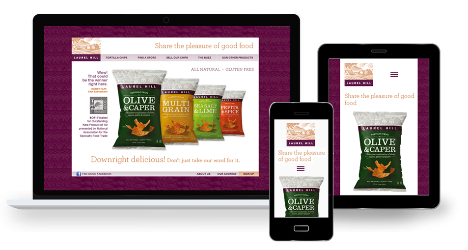
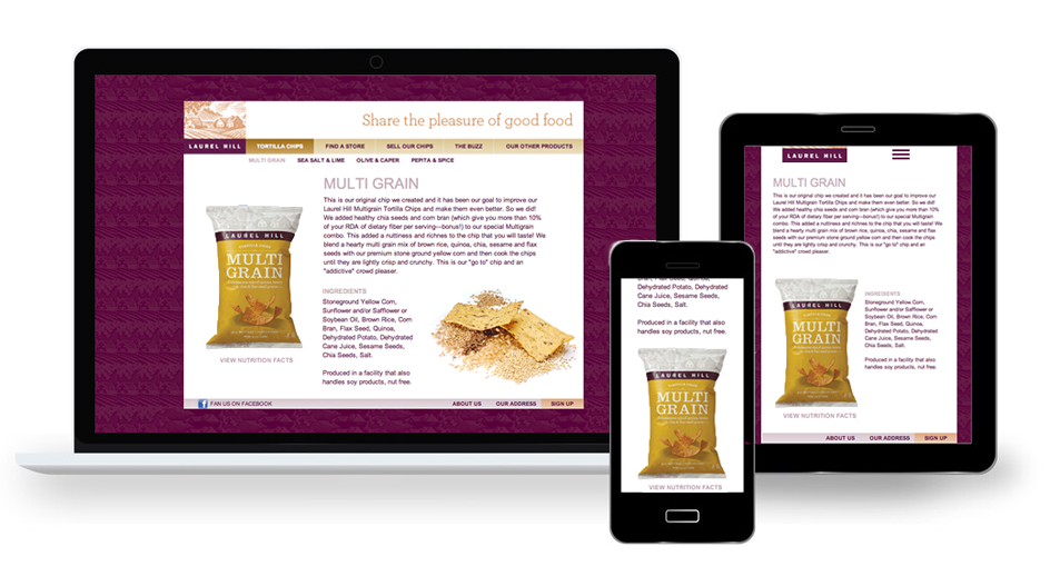
The layouts on this page are from microsites. The microsites were Internet based for marketing campaigns from a retail food company, an individual artist based in Estonia and a college exhibition.
Laurel Hill Foods: Microsite
These stills showcase the retail, marketing microsite for a few new products the Laurel Hill Foods company was releasing to select brick and mortar groceries such as Wholefoods. The prototype look and feel was assembled with flat graphic file layouts. My work went into producing the pages, advising on navigation, the interaction design of the menus and the landing page. Single bag items would shift slightly to the right and indicate whichever bag/flavor was chosen. The website prototype was built in HTML/CSS and JQuery along with a PHP/MySQL backend. There are four colors and four New Chip types to view.
Marika Blossfeldt: Book Announcement Pages, Microsite

This sample is part of a microsite Vegan Cookbook launch in the country of Estonia. The author is pictured here in a field of flowers and the language in the pages is Estonian. I designed the pages above to use the branding from the printed cookbook cover. The look and feel fit seamlessly into the cookbook advertising campaign.
School of Visual Arts: Event Microsite

These stills are from the New York Digital Salon 11th annual event series and exhibition, a project of the School of Visual Arts Computer Art Department. It was for a series exhibition titled Abstract Visual Music. I designed the look and feel in addition to the navigation, interaction and media content. I was also the technical producer of the site. It remains a sample of good design for a non-profit, fine art in electronic media situation. The website was authored in HTML/CSS.


